11 January 2021
Property sales brochures have always been a very significant component of marketing properties to homebuyers and they are now designed with fancy illustrations. Ever since the “First-hand Residential Property Sales Ordinance” ruled that detailed requirements had to be included in sales brochures, these brochures have grown in thickness.
The sales brochures of decades past were usually a few pages thick. The content was straightforward, focusing on the functionality and accessibility of the project that reflected what homebuyers expected and what they were willing to pay at that time.
The design of property sales brochures has evolved over the decades, and so has people’s perception of what liveable homes are.
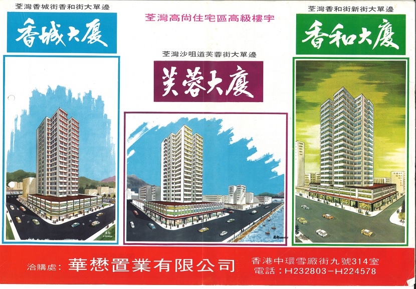
Some 50 or 60 years ago, the cover of property sales brochures usually depicted the building’s façade, much like what we see on the front page of modern brochures today.
Floor plans, including the number of flats, layout, floor area, and the locations of lifts and fire escape staircases, were illustrated in the inner pages. The content was usually written from the owner’s perspective, summarising the key features of the property succinctly.
The location was illustrated on the back cover. Since there was no MTR at that time, developers would pinpoint the locations of nearby bus stops and piers to attract buyers.

Some of the property sales brochures designed by Chinachem Group nearly 50 years ago.